A screen-by-screen tour of Tasks: To Do List & Reminders
Five real screens from the app, with what each one is actually for.
Published: November 19, 2026Screenshots on an app store page are easy to skim past. Here's a slower look at the five core screens in Tasks: To Do List & Reminders, what you're seeing in each one, and why it's built that way.
Home: your day at a glance
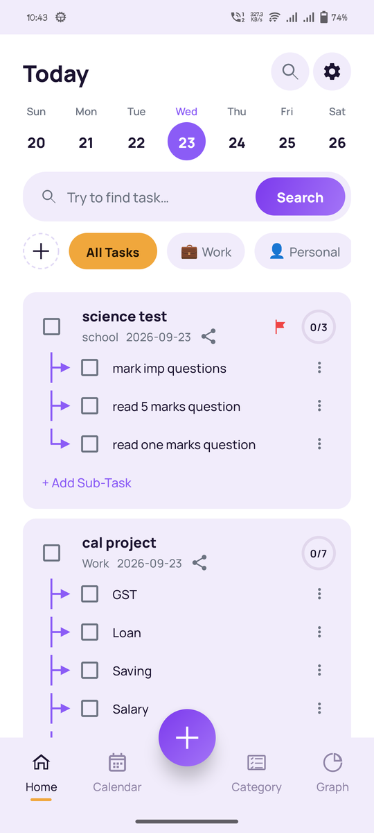
The Home screen lists today's tasks with a checkbox for each one and a progress bar at the top that fills in as you complete things. The idea is that opening the app should answer one question immediately: what's left for today?
Categories: organize by what matters to you
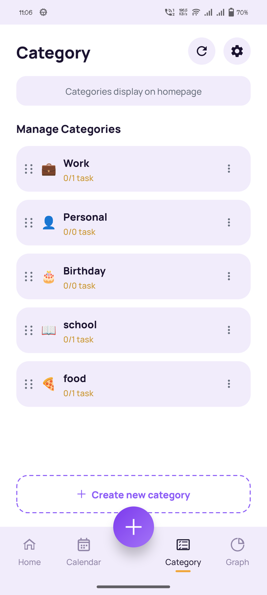
Each category gets its own emoji, name, and a live completion count, so you can tell at a glance how much of "Work" or "Health" is actually done. Categories are entirely custom. Nothing is preset or locked.
Calendar: plan more than just today
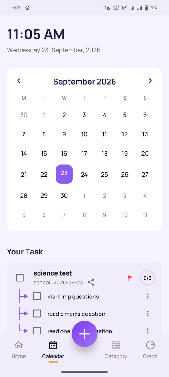
The calendar view lays tasks out by date on a month grid, with a day-by-day breakdown underneath. It's the screen to switch to whenever you need to see what's coming up, not just what's due right now.
Sharing: bring someone else into a task
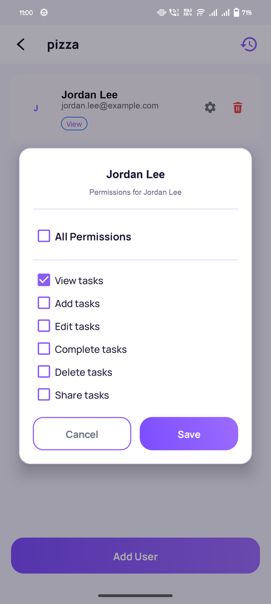
This is where you invite a collaborator and set exactly what they can do: view, add, edit, complete, delete, or full access. The full process is covered in how to share tasks with family or a team.
Progress: a weekly look at what got done
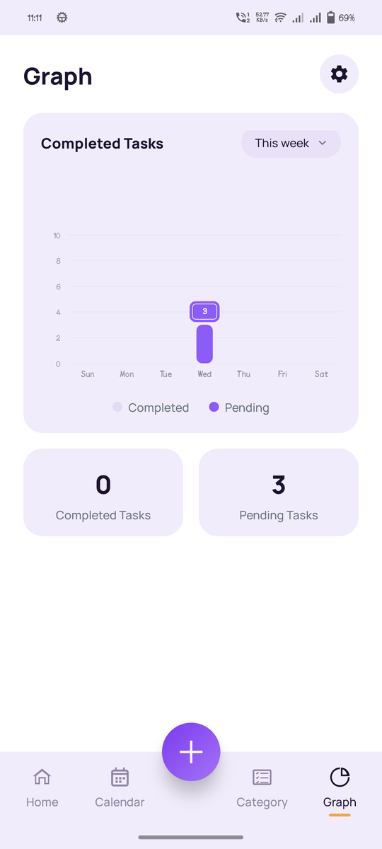
A weekly chart breaks down completed versus pending tasks by category, so you can see patterns over time instead of just today's snapshot: which categories tend to pile up, and which ones you consistently clear.
See it for yourself
Screenshots only go so far. The app is free, and guest mode lets you look around before creating an account.